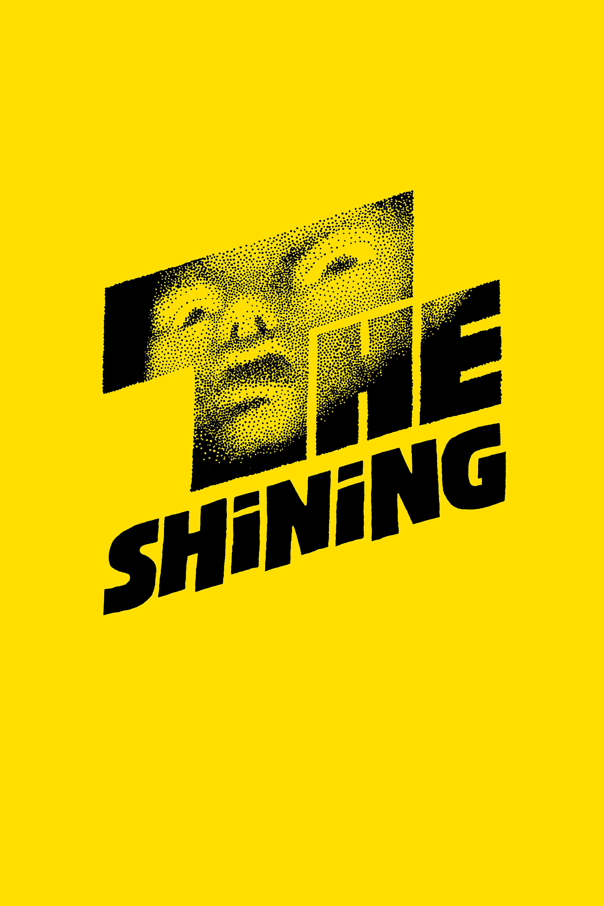
Nice flavor, as with most of Kubrick’s work. Kubrick’s style is very interesting and very apparent when you compare The Shining with 2001: A Space Odyssey and A Clockwork Orange. Formally, he uses extreme, bright, ultra-saturated contrasting colors or many similar drab colors. He also uses almost perfectly symmetrical square and rectangular buildings, furniture, and structures. Kubrick likes to convey spaciousness in room and outdoor POV and establishing shots, a neat way of suggesting isolation. His sets look remarkably sterile. Kubrick also uses unrealistically smooth motions (sometimes in slow-motion), whether it’s a person staring or moving or a door opening. Often, these motions are made in silence, making them even stranger. Odd camera angles really work for Kubrick, especially in The Shining. The Steadi-Cam following a character is another of Kubrick’s favorite toys. With his films, Kubrick likes to lead us into the unknown with the potential of danger, and he likes using orchestral noise and/or a choir holding a note for the duration of key scenes. Kubrick also likes to use title graphics to change the time/place of a story using a plain typeface on a black screen, a method which seems to “pause” the movie. Kubrick’s stories are generally slow-moving (which isn’t necessarily a bad thing) and use relatively few temporal cuts.
One of the better horror films out there. Kubrick’s got a knack for it. 2001: A Space Odyssey is almost a horror just because of the way it’s made. One of the things that helps separate The Shining from your cheesy horror film is that it has a real story that takes time to develop. It doesn’t rush into the blood and guts like too many films do today. The schizo kid and Dad are good examples of Doppleganger, a basic tenet of horror (yes Casper, I was taking notes). Thematically, Kubrick’s films are all about a breakdown in communication.
Most films leave the question of whether or not the house is really haunted ambiguous, but in this one, it undoubtedly is (how’d he get out of the food locker?). Then again, the cool twist at the end suggests that the whole story is in this man’s head. So we don’t really know if the house is really haunted or if it’s even there. Kubrick presents the psychic as good, the psychotic as bad. Interestingly, a lot of fairy tale references. The “redrum”/dagger scene is patterned after Psycho, even using the same music. That blood-out-of-the-elevators shot was kinda cool.
The acting is pretty shitty overall. Nicholson is pretty good as the psychotic (and even pretty funny at times), but as a normal guy, he seems pretty stale. Duvall is kind of ugly (which I suppose may have been good for the part), but her acting was unacceptably atrocious. It would have been better if Kubrick casted a decent-looking woman with the ability to portray realistic human emotions. That way, as the only sane person in the film, there would have been a good contrast between her and the others, showing us and emphasizing how truly fucked up the kid and Dad really are.

 I'm a
I'm a
Recent Comments